Deka Office Mobile
From Enterprise Bloat to a Single-Action Layer
Deka Office (Kontora) is a powerful enterprise document management platform. On desktop, dense functionality is a strength. On mobile, that same density becomes friction.
This project redefined the app as a speed-first action layer for high-frequency workflows, instead of a full mobile replica of desktop configuration depth.
Executive Summary
The core problem was enterprise feature bloat on mobile: users needed fast decisions and approvals, not full admin depth.
I redesigned the experience around an 80/20 action model, centered on critical workflows such as signing, reviewing, and document lookup.
The result was a faster mobile interaction model with lower cognitive load and stronger execution speed for day-to-day enterprise tasks.
Role & Scope
Role: Product Designer (mobile strategy and UI/UX execution)
Scope: Information architecture simplification, action-priority workflows, and gesture-driven interaction patterns.
Collaboration: Balanced user experience goals with technical delivery constraints across mobile wrapper architecture and web-view fallback paths.
01. Product Context
Product: Deka Office Mobile — an enterprise document workflow companion for approvals, signatures, and review on the go.
Problem: Desktop-level breadth was valuable on web, but on mobile it introduced feature noise when users needed immediate action.
Objective: Shift the mobile experience from configuration depth to execution speed, clarity, and reliable task completion.
02. Core Workflow Priorities
The Big Three (under 30 seconds): Electronic signature, task review, and file search.
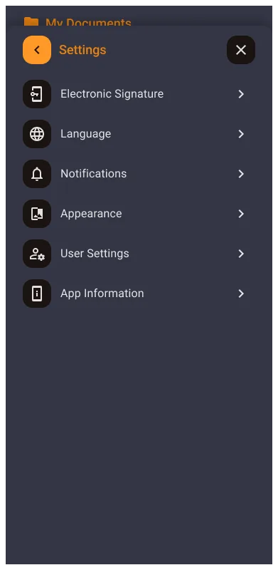
Bloat Removed: Deep configuration and settings menus moved out of the mobile default surface.
Primary Personas: Executives who need rapid approvals and field workers who upload or check documents in motion.
Technical Constraint: Wrapper architecture with native-feeling core interactions and web-view fallback for edge cases.
03. The Challenge: Desktop-to-Pocket Friction
The legacy interface was built for power users on large screens, not touch-first mobile usage.
This created information overload (15+ links and deep menus), interaction errors on touch, and high action latency for simple tasks like signing or approval.
The redesign objective was not feature parity, but task completion velocity for high-frequency micro-moments.
04. Strategy: One-Page Philosophy (80/20)
Instead of porting the full desktop stack, the app was positioned as an action layer. The mobile surface contains the critical 20% of actions that drive 80% of daily productivity.
| Feature Category | Web Dashboard | Mobile App |
|---|---|---|
| Philosophy | Deep Configuration | Instant Action |
| Navigation | Multi-level Sidebar | Single Central Hub |
| Interaction | Multi-click Paths | One-Finger Gestures |
| Scope | 100% of Features | Critical 20% |
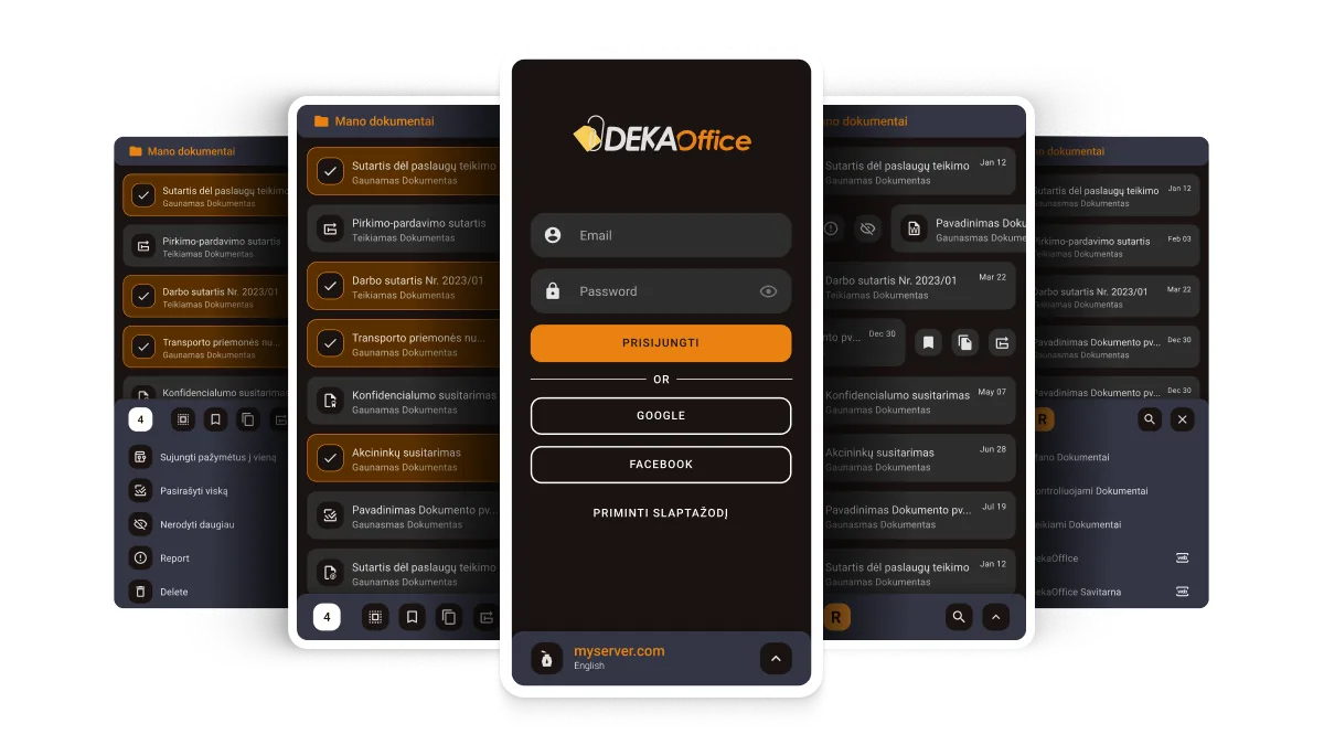
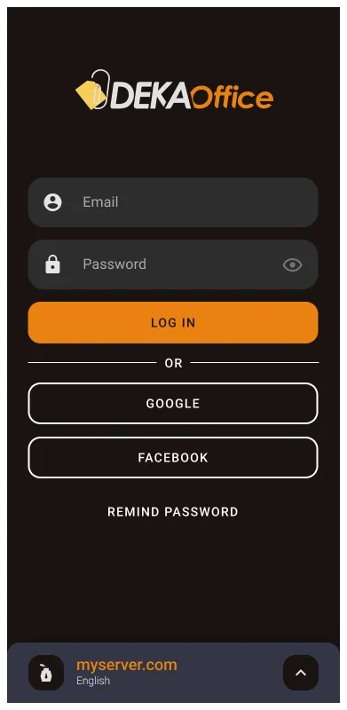
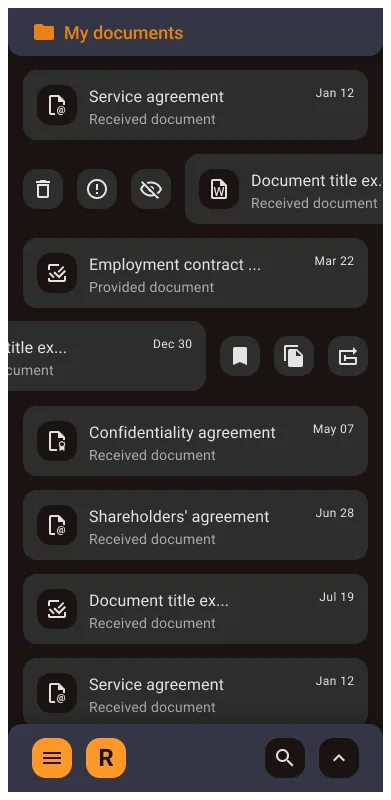
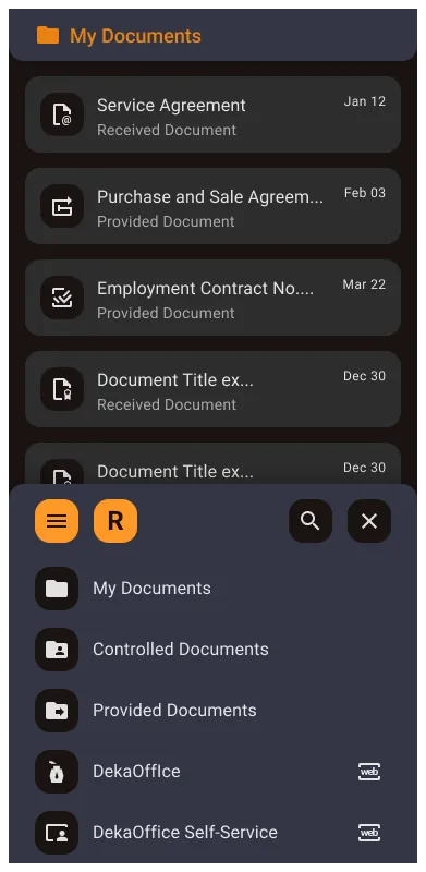
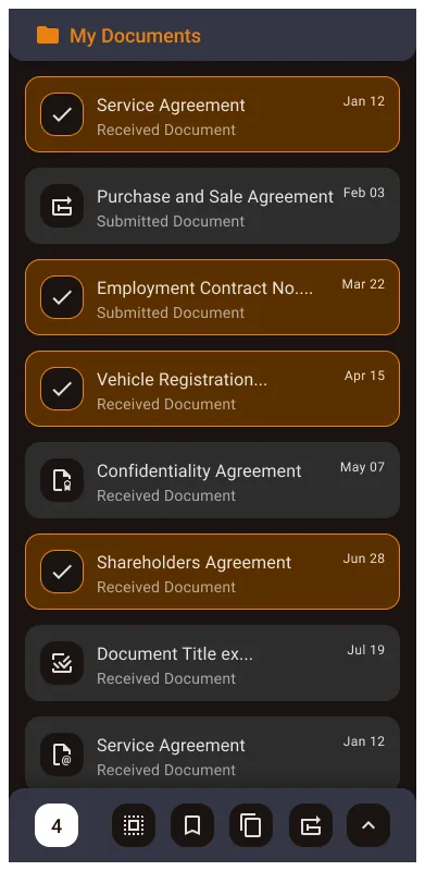
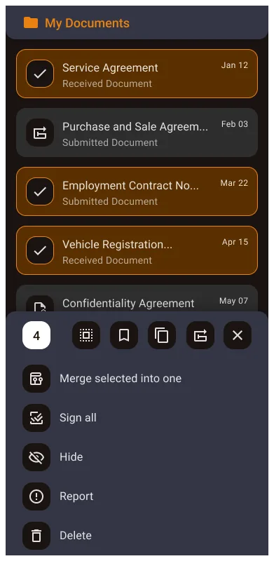
05. Solution: "Mano Dokumentai" Action Hub
A single high-performance document hub handles core lifecycle actions with clear visual state communication.
Dense labels were replaced with color-coded icons and status hierarchy so users can scan large lists quickly.
A dual swipe model reduced UI clutter: swipe right for quick approval/signature, swipe left for archive/pin.
Technical implementation used a native core for speed-critical flows and a seamless web-view bridge for rare edge-case settings.
System Adaptation for Mobile
The mobile system preserves speed-critical paths in a native layer while routing edge-case configuration to a web-view bridge. This keeps common actions lightweight without sacrificing enterprise coverage.
Planned snippet: native-first task flow with web-view fallback for advanced settings.
Core Mobile Hub Screens
Ordered flow from authentication through multi-select actions and settings in the "Mano Dokumentai" hub.
Scroll horizontally to browse screens, then click any image to expand.
06. Impact and Metrics
07. Outcome Recap
Enterprise mobile design is often about editing, not adding. Removing low-value complexity can create more impact than shipping more screens.
Once learned, gestures become invisible shortcuts that let users act without cognitive overhead.
Wrapper constraints can be strategic when used intentionally: native where speed matters, web-view where coverage matters.
08. Next Step
Next, I would explore voice-assisted search to reduce time-to-document for workers in motion and further improve one-handed field usability.